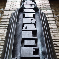
Architectural font digitisiation and design
Typographic pipeline with Graphviz, Inkscape and Fontforge
- Track: Open Source Design devroom
- Room: AW1.121
- Day: Sunday
- Start: 15:00
- End: 15:20

Numerous works of architecture, furniture, sculptures, illustrations and typography were made during the 1920s by a modernistic style called the Amsterdamse School. A lot of these works are not easily accessible and, even though preservation efforts are being taken, many are deteriorating over time. This talk will elaborate on how FOSS design and typographic tools were developed and used to digitise and extend a century old font under an OFL.
To aid the effort of preserving and reuse minimalistic – though often playful – designs from the early 20th century, Stichting z25.org ran a project where an sculpted incomplete typeface was digitised and made available as a font. The focus of this case study was on typographic design, FOSS development and co-funding.
This project used contemporary cultural entrepreneurship by combining crowdfunding and public funding to finance this project. As a side-effect, the crowdfunding campaign contributed to local awareness about the existing cultural heritage and more insight to the amount of work required for typographical designs.
After completing a study of the original artist's works, a pipeline of several FOSS design tools was set up to meet this challenge. Graphviz was used to categorise and divide the design workload in infographics which also show character interdependencies. Additionally, we show how design work and collaboration can be managed more in Agile environments. The individual glyph designs were done in Inkscape and the font files were generated by using FontForge.
FontForge offers sharing guides (lines supporting and accelerating the design process) amongst glyph designs, however Inkscape has no such facility as the individual SVG files are not synchronised for this. We developed a tool in Python to selectively synchronise guides.
In this presentation, z25.org will talk you through their adventure of funding, developing, digitising, designing and sharing. The result is a preserved and revitalised typeface called Neude that lay dormant for over a hundred years on impressive statues in the former post office in Utrecht, the Netherlands.
Speakers
| Sander van Geloven |